This post has been split from the Website Suggestions thread, so that we could get a separate thread and make a poll. I have added the pictures to reduce the challenge of tracking them down. Big thanks to Betsy for taking the initiative.
--Sav, Mod@Large
Just for fun, here are a few possibilities of art for an updated logo.
go to http://www.istockphoto.com and look at these illustrations: (you have to do a search for these numbers) - they're all within the BRAIN category... which, brains aren't really very attractive but here are a few that might work:
4425575:
3222708:
4064740:
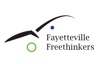
Current corner logo:
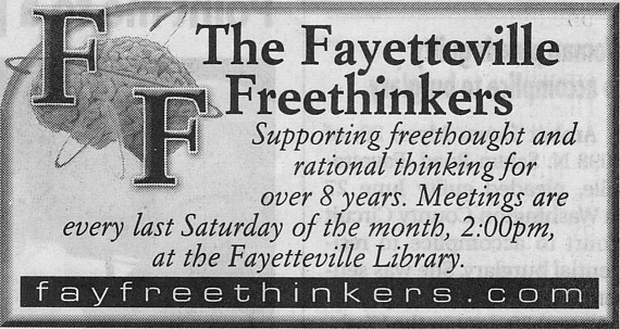
Newspaper ad logo:
Vote for which one you like best, or if you prefer the existing brain logo.
Wow, such potential. The first one, is a neat idea. It's is so poky with this big lightening bolts. Freethinkers are kind of poky sometimes. Maybe to poky.
The lightbulb is beautiful with wonderful colors and all but are we really associated with ideas? Is that one free? We can just have it as a logo? Doesn't quite fit.
The duel lightbulbs have some alien eyeball issues.
Our current one is primitive, workable, meant to be temporary but we can do much better.
Now, regarding the news paper ad. The black and white ad does not remotely do justice to the original full color. The digital color version is absolutely jawdropping gorgeous. What you see below is just a crappy scan of the okay black and white newspaper ad. Thing is, I don't know if we can have the rights to use this logo the newspaper used. I don't know where it came from.
I will inquire. If we can't there is no use in me bringing it up and we will have to work with these or another. So right now, I am withholding my vote.
D.
----------------
ps And how much do we want to emphasis the brainy thing? It can be seen as kind of snobby, like "The Brights." I guess if it is understood to mean Use YOUR Brain! Or, come hang out with us, we can inspire you to use YOUR brain!
so the one you posted in color on the other thread is the same one that's on the newspaper ad? Because you're right, the b/w version doesn't do it justice. All the ones I suggested are available to purchase cheap and may be used. I'm also withholding my vote until DAR finds out about the rights to the last choice.
perhaps we should just stick to the ones we know we can use - and since the one in the newspaper ad doesn't transfer well to black-and-white, it's not a good choice, anyway. You need something that will look good in ads, color or b/w, tee-shirts, bumper stickers, etc. So it should be bright and clear. As of now, probably the first choice fills that bill the best, so I'm going to go ahead and vote for it since this is just a poll and not something we're necessarily binding the freethinkers to, anyway.
Of course, that's just the illustration part of the logo - still needs text/letters/whatever -
Betsy wrote: - and since the one in the newspaper ad doesn't transfer well to black-and-white, it's not a good choice, anyway. You need something that will look good in ads, color or b/w, tee-shirts, bumper stickers, etc.
DAR
I don't know that the news paper ad logo won't transfer well to black and white. I think it will. What you see above is just a really crappy scan out of the newspaper. If I can get the super clear color digital version version I think it will look great in black and white too.
I have been very busy this week, working every day into the evening so I haven't had time to go by the newspaper. I'll try to go Monday. It's my birthday and I am taking the whole day off damn it!
DAR
Sorry for the delay, I am a very very busy guy. Good news. I went by the newspaper today and they said they would email the brain picture from our ad. No charge. I haven't gotten it yet. As soon* as I do, I'll post it.
DAR
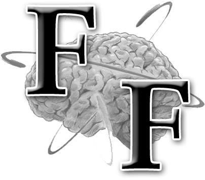
They finally sent it to me when I went back and bugged them. Here is a good digital version of the logo but the brain isn't full color which is what I was remembering.